


A few minutes at a bus stop
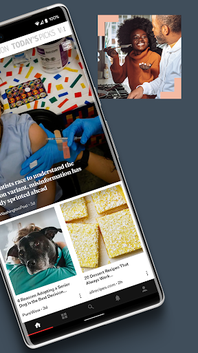
You have got the phone out with time to fill, and the choice is a wall of blue headlines or something laid out like a magazine. Flipboard was built for the second instinct, and on that narrow ground it still wins comfortably.
Building the stream
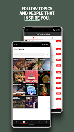
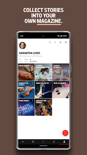
Setup is picking topics and following publications, after which the app assembles pages out of them. Add a subject and the stream shifts sensibly, drop one and it stops turning up. Saved articles stay where you left them, and collecting pieces into your own magazine takes a tap.
Reading rather than scanning
The reading view is the best thing here. Typography makes a long article comfortable on a phone instead of merely possible, photographs get room to work, and on a tablet the layout adapts rather than stretching. Next to a list of links it looks like something people actually thought about.
Why the score landed low
The aggregation idea aged badly. The same stories reach you through the reader already sitting on your home screen, usually sooner, and the curation here is not distinctive enough to make the detour worth taking. That is the whole problem in one sentence: nothing arrives that you would otherwise have missed. The social layer makes that worse rather than better, since flipping articles into a shared magazine feels like posting into an empty room where nobody answers. The app can drag while you do it, and the interface has been reshuffled unevenly across updates, so a habit you built one month sits somewhere else the next.
For people who read with their eyes first
If presentation is what gets you to finish an article rather than skim it, this handles presentation better than the default on your phone does. If you only want the stories, they are already reaching you elsewhere and faster. Give it a proper week of reading before deciding it has replaced anything, and be honest afterwards about whether you opened it out of interest or out of habit.
From the Play Store listing
These figures come from the official Google Play listing and can change at any time. Check the current listing.
- Play rating
- 3.4 out of 5
- Ratings
- 1,412,208
- Installs
- 500,000,000+
- Developer
- Category
- News & Magazines
How those ratings split