

It opens on the camera, not a feed
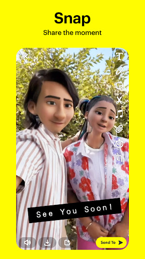
Snapchat still opens straight into the viewfinder, and after all these years that remains the clearest single statement of what it is. You are meant to send a picture, not read one. Everything else in the app is arranged around that reflex.
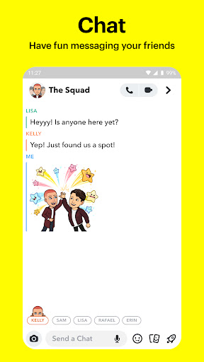
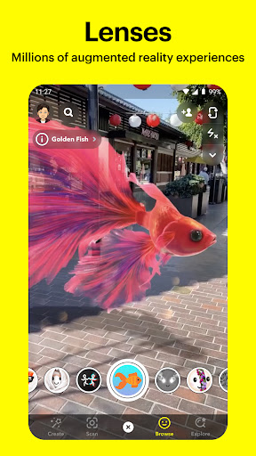
Firing a photograph off to two friends takes a couple of taps, and the impermanence changes what people are willing to send, which is the actual product rather than a feature of it. Lenses are the technical showpiece: effects that track a face properly, hold together in bad light, and arrive in fresh batches constantly. Stories in vertical video started here and every rival copied the shape. Streaks turn daily contact into a small shared obligation, charming or tyrannical depending on your age. The friend map is either the best thing in here or the most unnerving, and it can be switched off completely.
Lenses, and the reflex to reach for it
The camera-first design is still the lead. Nothing else makes sending a daft picture of your own face this fast, and the AR work is real engineering rather than a marketing line, which you notice when you try the equivalent elsewhere and it slides off your chin. For the people it was built for, the combination holds even when individual parts irritate, because the alternative is not a better app, it is not talking to those friends in this way at all.
An interface that refuses to explain itself
Navigation is where a lot of people bounce, and it is the con that shapes the score. Screens sit to the left and right of the camera with nothing on screen saying they are there, actions are gestures rather than buttons, and a newcomer can spend a week unsure how to get back to a conversation they just left. Successive redesigns have shuffled it without fixing it. Arguably the opacity is deliberate, a filter that keeps the people who learned the moves young, but it means handing the app to anyone new comes with a tutorial you have to deliver in person.
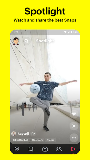
Discover is the other drag, a tabloid strip of clickbait parked in prime navigation space that plenty of users never open, and battery and data use run high for something that is largely messaging.
Which leaves the question that settles it: your friends. If they are here, this is a fast and funny way to talk to them and the lenses alone are a reason to stay. If they are not, none of the engineering matters, because a camera with nobody to send to is just a camera.
From the Play Store listing
These figures come from the official Google Play listing and can change at any time. Check the current listing.
- Play rating
- 4.2 out of 5
- Ratings
- 39,555,101
- Installs
- 1,000,000,000+
- Developer
- Snap Inc
- Category
- Communication
How those ratings split